The Eden of Apples
This story shows how climate volatility can collapse yield even when the valley still looks healthy, and where adaptation becomes urgent by 2050.
Val di Non, carved into the Italian Alps, produces nearly 1 in 5 apples eaten in Italy. More than 20,000 small parcels, managed by 4,000 farming families in a regional cooperative, make the valley look like a model of agricultural stability.
But that stability depended on a reliable seasonal script. Warmer springs, unstable cold snaps, and more erratic extremes are now breaking the timing that orchards once could trust.
The Secret: The Taste of the Dolomites
The valley's edge came from alpine precision: predictable cold winters, mild summers, and a 15°C daily temperature variation protected by surrounding mountain chains.
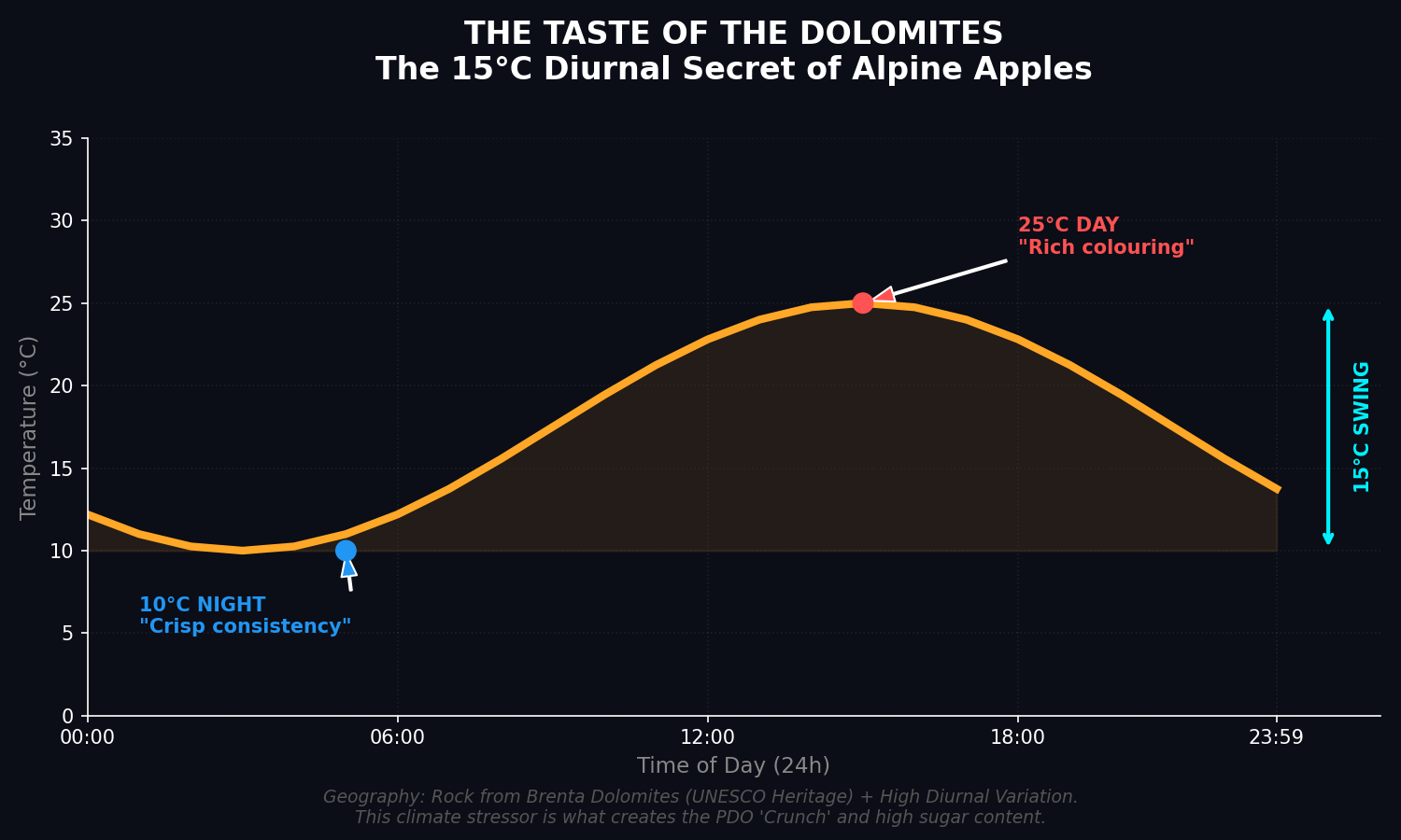
That thermal rhythm is what built the valley's famous apple color and crunch. It is also exactly what climate volatility is now destabilizing.
The Satellite's First Clue
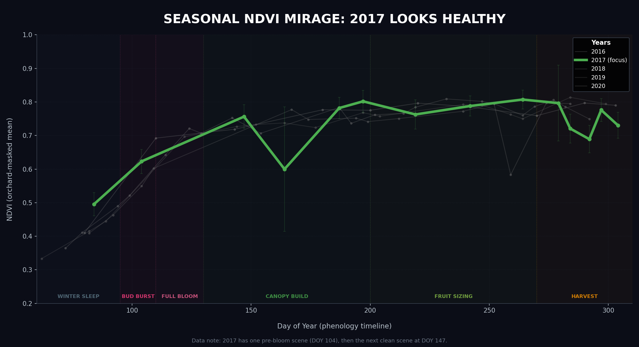
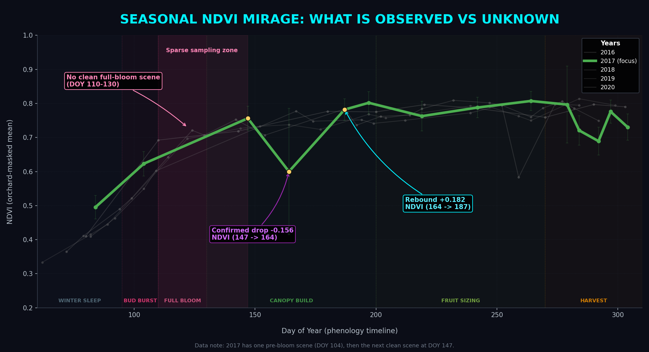
To understand the catastrophic harvest crash of 2017, we first pointed satellites at the "scene of the crime" to see if the orchards looked sick or dying.
In September 2017, just weeks before the apples were scheduled to be harvested, the European Space Agency's Sentinel-2 (Copernicus) satellite constellation scanned the valley. It measured the Normalized Difference Vegetation Index (NDVI) : a standardized proxy for photosynthetic health and green biomass. (In plain terms: NDVI is a 0–1 score of how green and photosynthetically active the vegetation is. Near 1.0 = dense healthy canopy. Near 0.2 = bare soil.)
Technical Methodology: Surgical Spectral Recovery (For Data Geeks Only)
- The Calculation: We extracted Sentinel-2 Level-2A imagery, calculating NDVI using the Near-Infrared (Band 8) and Red (Band 4) spectrums.
- Surgical Masking: Alpine valleys are noisy. To ensure we were measuring apple trees and not pine forests or asphalt, we clipped the satellite pixels strictly to 42,100 individual GPS-mapped orchard polygons.
- Cloud Combat: Sentinel-2 visits every 5 days, but mountain weather is highly obstructive. We applied a strict Scene Classification Layer (SCL) algorithm to mask out clouds and mountain shadows. Only optically pure pixels were kept.
- The Scale: Over an 8-year baseline (2016-2024), we downloaded and processed over 350 Gigabytes of raw multispectral data across 560+ orbital passes. This generated a massive data cube of 23.5 million individual plot-level readings to establish the valley's true historical baseline.
The satellite confirmed what farmers could see: the trees were vibrantly healthy. In fact, NDVI was actually +2.9% higher than the 10-year historical average.
But the Trees Were Barren
What the satellite couldn't see was that the vibrant green leaves were hiding a catastrophe. The 2017 harvest was decimated.
Compared to the 10-year historical average, yield crashed by a staggering 63% across the valley. The trees had leaves, but no fruit. They were physically healthy, but economically barren.
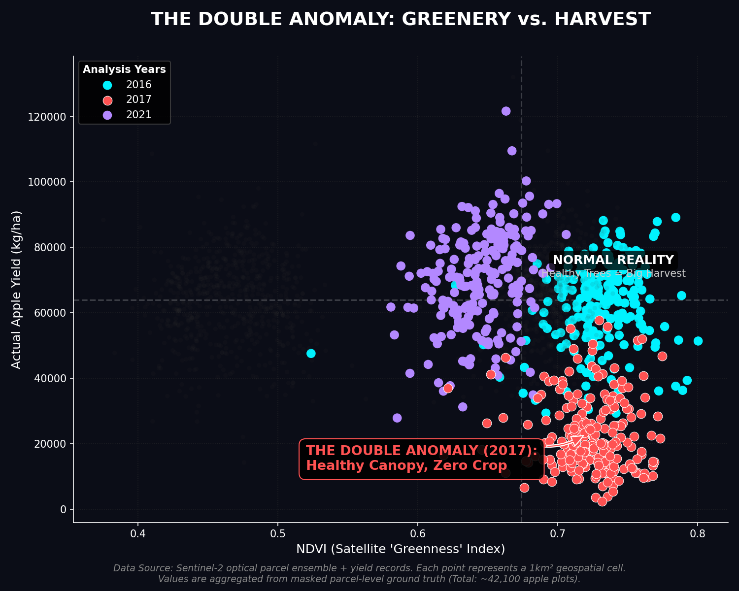
This is the "Double Anomaly." How does an orchard flourish vegetation while its fruit production collapses entirely?
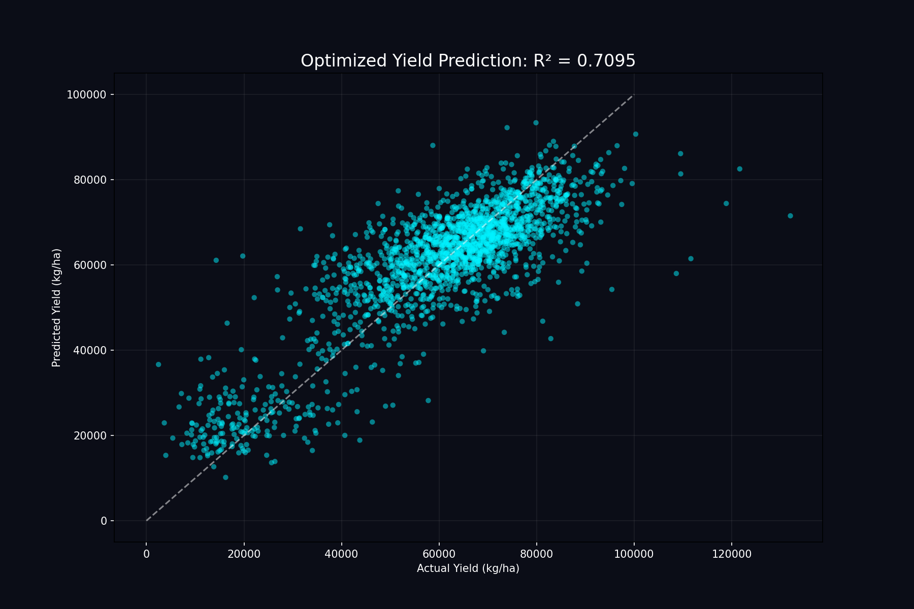
Cracking the Code with AI
We trained AI to answer one hard question: can it detect a real yield disaster even when the canopy still looks green from space?
Satellite-only signals were completely blind to the true cause. But once we fused the satellite data with high-fidelity ground station observations (like frost timing and severity from MeteoTrentino) and complex climate interactions, the model stopped being fooled by a healthy-looking leaf canopy.
Show model validation details
We used a Spatial 5-Fold Cross-Validation — holding out a different group of 1km orchard cells in each fold. This tests whether the model can predict yield for cells it has never seen before, purely from their climate and satellite fingerprint.
| Algorithm | Features | R² Score | Validation |
|---|---|---|---|
| Hybrid XGBoost | 15 selected features (Sentinel-2 + CMCC Reanalysis + MeteoTrentino Stations) | 0.69 | Spatial 5-Fold CV |
Spatial 5-Fold Cross-Validation: each fold holds out ~44 unseen 1km orchard cells.
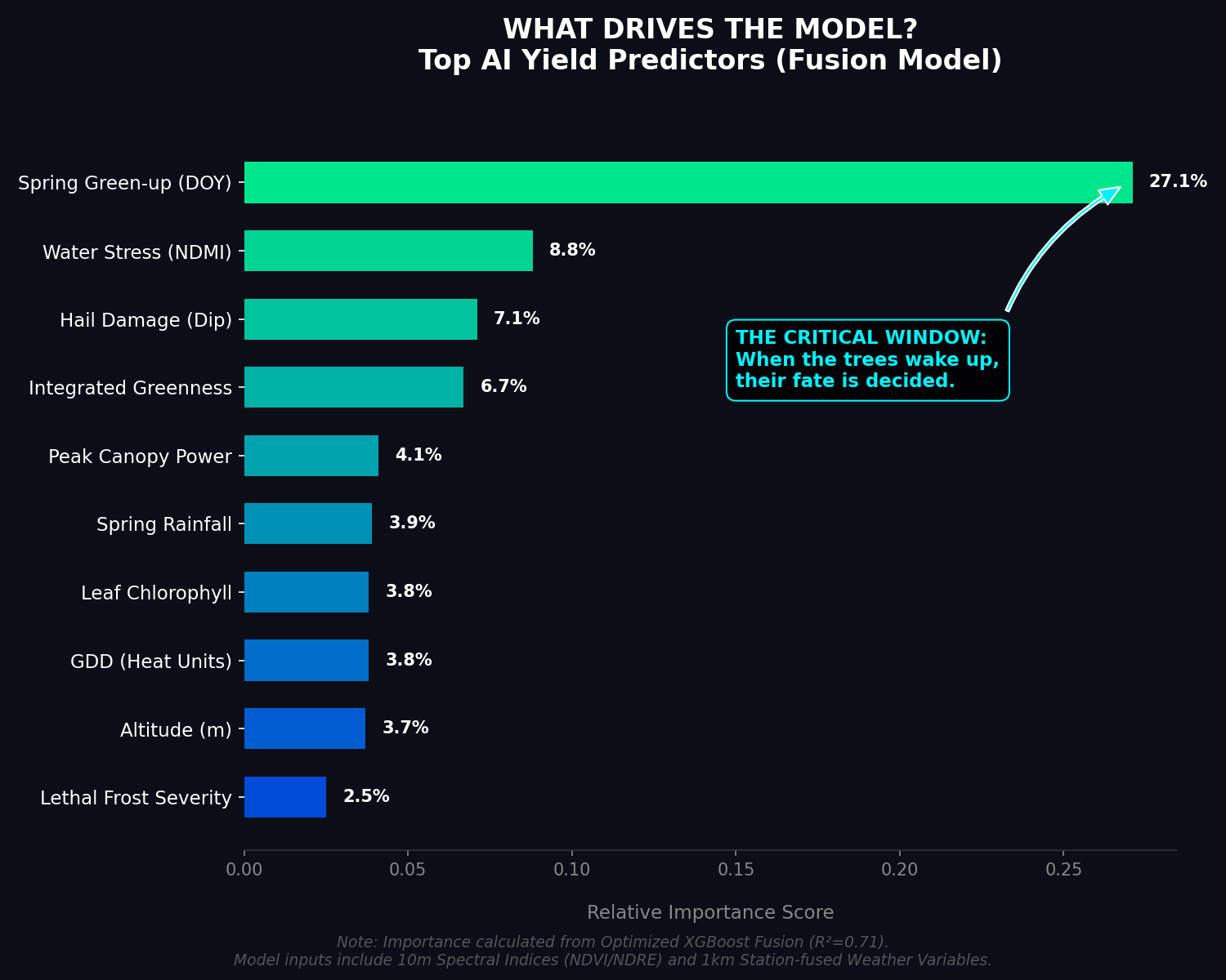
Data Forensics: What the AI Learned (For Geeks)
The model's verdict is unambiguous: 80.6% of its predictive power comes from three features, all measured directly from ground station thermometers — no satellite, no model. The key is not how cold it got, but when:
Post-bloom frost severity — station observed (52.6%)
How it's derived: Computed directly from raw daily tmin observations at the 7 MeteoTrentino stations (no downscaling, no model). GDD accumulation from Jan 1 determines bloom date; every sub-zero degree recorded after that date is summed.
Why it matters: In 2017, this value was the highest in the dataset — a warm false spring triggered early bloom, then the April frost hit exposed blossoms directly. Frost before bloom does zero damage; the same temperature after bloom is catastrophic.
Post-bloom lethal frost days — station observed (27.3%)
How it's derived: Same station observations as above; each day where valley-average tmin < −2°C after GDD bloom date is counted.
Why it matters: Even one night below −2°C after bloom can abort the entire fruit set. 2017 had the highest post-bloom lethal frost day count in the record.
Coldest night after bloom — station observed (2.7%)
How it's derived: Min of valley-average tmin across all days after bloom DOY, from raw station records.
Why it matters: Captures extreme event intensity — a single night at −5°C after bloom can destroy an entire season's crop in a single freeze event, as happened in 2017.
Hail shock × Canopy health (Satellite NDRE dip)
How it's derived: Calculated as
|max_hail_dip| × peak_ndvi from Sentinel-2. A healthier canopy that then crashes harder signals severe hail damage.Why it matters: Captures extreme, localized hail events (like the 2018 Castelfondo and 2021 Predaia supercells) that broad climate models completely miss. The satellite acts as the ultimate ground-truth damage proxy.
Summer max temperature / Mean Tmax (1.1%)
How it's derived: Aggregated from the CMCC XGBoost-downscaled daily tmax grid for each cell-year.
Why it matters: Secondary stressor — sustained heat above 32°C during fruit development causes vapour pressure deficit stress, reducing final fruit size and sugar concentration even when the frost event is survived.
The Silent Killer: Timing > Temperature
We checked 32 years of ground-truth data from the official MeteoTrentino Station Network and found the key paradox: both 2018 (-6.7°C in March) and 2021 (-6.3°C in early April) were colder than 2017 (-5.0°C in late April), yet they did not trigger the same collapse.

The difference was phenology. In 2017, a false spring pushed blossom opening into mid-April, and then April 18-21 dropped below the -2°C damage threshold and the -4°C catastrophic threshold. Leaves survived, blossoms did not, which is why space still saw green while yield collapsed.
What the radar still saw through the clouds
We saw the 2017 story through Sentinel-2 spectral signals and weather station ground data. The next question is whether Sentinel-1 radar could add a third witness, especially when cloud cover hides the valley during the April frost window.
Click to see what radar could add
- It could reduce the spring sampling gap with parcel-level VV, VH, and change anomalies.
- It could track wetness and surface conditions that shape frost exposure on the valley floor.
- It could compare pre- and post-event structural disturbance after hail when optical scenes are blocked.
Radar is powerful in cloudy periods, but alpine terrain complicates the signal. Slopes, orchard row orientation, layover, and shadow mean Sentinel-1 would work best here as a relative anomaly layer, not as a direct temperature measurement.
The Ghost of Hail
Beyond frost, the valley is regularly hit by devastating supercell storms. These localized "Hail Corridors" can destroy a harvest in minutes. While broad climate models completely miss these localized micro-bursts, the satellite acts as the ultimate polygraph test.
The Forensic Signature
Unlike frost, hail creates a "Spectral Dip."
Explainer: The Red-Edge Signature
In the chart below, you can see a sharp drop in NDRE (Normalized Difference Red Edge) during the summer. Unlike standard greenness (NDVI) which remains high even when fruit is destroyed, NDRE captures the internal chlorophyll stress of the physical stems and leaves after being hammered by ice.
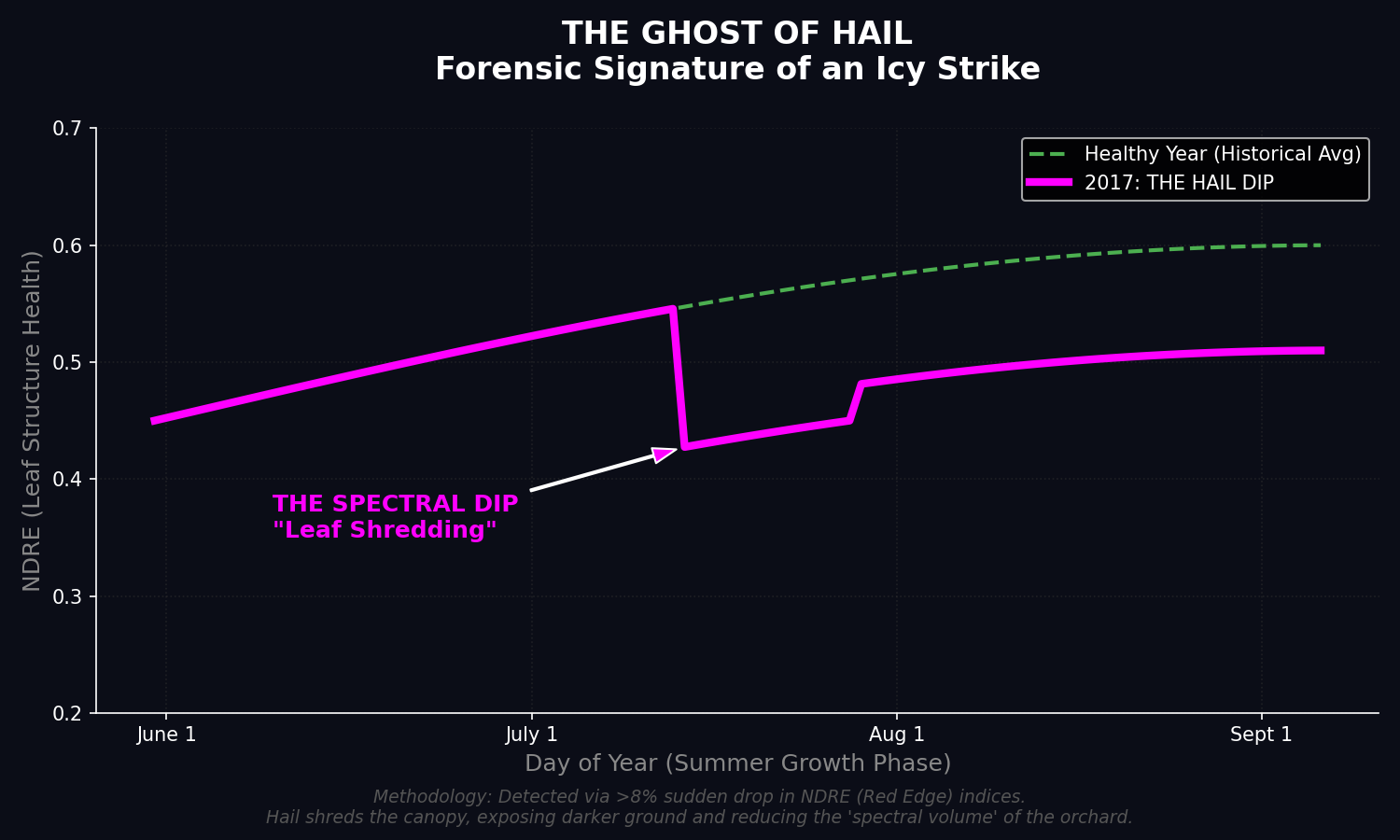
The AI model learned to spot these sudden drops. By connecting them across the terrain, we mapped the recurring "Hail Corridors"—meteorological bowling alleys where landscape topography naturally funnels standard storm cells into icy strikes.
The 2050 Reality & The "Blurry Valley"
Predicting 2050
To prepare for the future, we need to ask climate models what the valley will look like in 2050. But there is a major problem: standard climate models see the world in large, 5-kilometer blocks. For a complex mountain region like Val di Non, that resolution is entirely too blurry.
This creates the "Blurry Valley" problem. A single 5km block acts like a giant blender, averaging the temperatures of high mountain peaks and deep valley floors into one single, safe-looking number.
In reality, freezing air is heavy. On cold spring nights, it drains down the mountains and pools directly on the valley floor. While a standard climate model might predict a safe +4°C average for the whole block, the actual apple orchards trapped at the bottom of the basin could be experiencing a lethal -4°C frost. If we trust the "blurry" model, the disaster remains invisible until it strikes.
Click to unpack CMIP6, projections, and reanalysis
Climate projections are modelled futures under different greenhouse-gas pathways. They are not weather forecasts for one day; they are scenario-based estimates of how conditions shift over decades.
Spatial resolution means the size of each grid cell in the model. A coarse global CMIP6 cell is roughly 100km across, so one cell can blend mountains, valleys, lakes, and plains into one average value.
Downscaling means taking that coarse climate signal and translating it to a finer local grid. In this story, the chain is: global CMIP6 (~100km) -> regional CMCC product (5km) -> our orchard-scale correction (1km).
CMIP6 is the international model framework behind many of those futures. In this project, CMCC provides the regional future baseline that preserves the broad warming trend.
Reanalysis combines observations with physics-based models to reconstruct past atmospheric conditions. Products like ERA-5 help anchor the regional climate field, but even a refined 5km surface still smooths away orchard-scale basin physics.
That is why we still downscale again. Our final step does not invent a new future; it learns the local delta from stations, terrain, and cold-air pooling, then applies that correction inside each coarse regional pixel.

Simulate the Frost Pocket
Use the slider below to simulate cold-air pooling on a freezing spring night. Watch how heavy, freezing air (the blue plane) fills the bottom of the basin first, burying lower orchards in lethal frost while trees just a few meters higher survive. A standard 5km climate model averages this entire valley into one "safe" number, completely missing this life-or-death elevation boundary.
Loading the 3D comparison...
The AI Downscaling Solution
To fix the "Blurry Valley" problem, we use a machine learning model called XGBoost. It takes the large, blurry 5km blocks from standard climate models and "downscales" them into a sharp, high-resolution 1km grid.
How does it do this? By learning directly from the 7 local weather stations scattered across Val di Non. Because these physical stations perfectly capture the extreme microclimates of the valley floor, the AI can use their data to correct the blurry climate models. This brings the invisible, localized frost pockets back into focus.
Want to see how the AI does it? Click through the interactive steps below.
Click a step to reveal one layer of the 1km map. The technical detail stays hidden unless you open it.
Anchor the valley to local truth
Loading the interactive Act 4 explainer...
More detail
Predicting Yield Failure Risk
The map is now a live predictive tool. Every 1km cell gets a Yield Failure Risk Score by combining the two lethal drivers our AI identified: altitude-driven frost exposure and historical hail corridors.
The red and orange cells are the high-risk zones where these threats overlap. This is where adaptation budgets pay back the fastest.
Use netting where repeat strike paths already appear in the record.
Deploy precision water where heat stress compounds the damage.
Plan varietal/elevation shifts where spring losses keep repeating.
Show scoring method & math
The Combined Risk Score is a dynamically calculated blend of four primary physical drivers (weighted equally at 25% each) and altered in real-time by your mitigation choices:
frost_[era] · 25% weight)Driven by altitude-temperature interaction. Reflects post-bloom freezing intensity where low-elevation basin floors experience extreme radiative cold air pooling.
• Mitigation: Automated Frost Fans reduce active frost risk by 70% (coefficient:
0.3).
heat_[era] · 25% weight)Aggregated from cumulative Growing Degree Days (GDD) and XGBoost-downscaled CMCC summer maximum temperature (Tmax) projections. Represents the frequency of sustained temperatures above 32°C which trigger VPD (Vapour Pressure Deficit) crop stress.
• Mitigation: Precision Irrigation reduces heat stress impact by 60% (coefficient:
0.4).
volat_[era] · 25% weight)Calculated from multi-year historical registries to isolate cells subject to severe alternate-bearing cycles and erratic crop productivity. This represents structural baseline instability and remains unmitigated.
hail_event_count / 8 · 25% weight)Normalizes the occurrence of historic severe hail strike tracks—captured via Sentinel-2 spectral dips (
|max_hail_dip| × peak_ndvi)—against a maximum observed baseline of 8 strikes.
• Mitigation: Anti-Hail Netting reduces mechanical strike risk by 90% (coefficient:
0.1).
Risk = [0.25 × (Frost × fFrost)] + [0.25 × (Heat × fHeat)] + [0.25 × Volatility] + [0.25 × ((Hail / 8) × fNet)]
How to use the Explorer:
- Hover over cells: See the exact local data.
- Era Selector (Top Left): Jump between 2040, 2070, and 2100 scenarios to watch the risk spread.
- Adaptation Planner (Bottom Left): Toggle Anti-Hail Netting, Irrigation, or Frost Fans to see the map instantly recalculate the saved risk.
The Map is Yours
You are now in free-explore mode. The story is over, and the live tool is unlocked.
Methodology & References
This project was built following the Martini Glass structural methodology (Segel & Heer, 2010), transitioning from an author-driven forensic narrative to a reader-driven strategic exploration tool.
Academic References
- Segel, E., & Heer, J. (2010). Narrative Visualization: Telling Stories with Data. IEEE Transactions on Visualization and Computer Graphics, 16(6), 1139-1148.
- Kosara, R., & Mackinlay, J. (2013). Storytelling: The Next Step for Visualization. Computer, 46(5), 44-50. [Authorized licensed use limited to: University of Edinburgh. Downloaded from IEEE Xplore. Restrictions apply.]
- Unwin, A. (2020). Why Is Data Visualization Important? What Is Important in Data Visualization? Harvard Data Science Review, 2(1).
- Crespi, A., Laiti, L., Ramella Pralungo, M., & Giovannini, L. (2021). High-resolution daily gridded dataset of temperature and precipitation for the Trentino-South Tyrol region (North-Eastern Italian Alps). Earth System Science Data, 13(6), 2883-2900.
- Bhakare, P., Giovannini, L., & Zardi, D. (2024). Statistical Downscaling of Temperature Projections in Complex Alpine Valleys Using Machine Learning Algorithms and High-Resolution Observational Data. Journal of Applied Climatology and Meteorology.
- Chen, T., & Guestrin, C. (2016). XGBoost: A scalable tree boosting system. Proceedings of the 22nd ACM SIGKDD International Conference on Knowledge Discovery and Data Mining, 785-794.
- Frampton, J., Dash, J., Watmough, G., & Milton, E. J. (2013). Evaluating the capability of Sentinel-2 data for estimating canopy chlorophyll content and leaf area index. ISPRS Journal of Photogrammetry and Remote Sensing, 82, 83-92.
Show Core Computational Pipeline & Tech Stack
Our complete end-to-end spatiotemporal machine learning and visual analytics pipeline is composed of the following core technologies:
- XGBoost Regressor: Standard-of-care gradient boosting for yield prediction (R² = 0.69 spatial CV) and microclimate downscaling.
- Scikit-Learn: Robust validation including GroupKFold (spatial blocks) and LeaveOneYearOut (temporal blocks).
- Pandas & NumPy: Multi-stream data fusion and trapezoidal numerical integration (
np.trapz) for satellite phenology. - SciPy: Topographic image scaling and array smoothing algorithms.
- GeoPandas & Shapely: Spatial coordinate projection (CRS transformations) and geometric parcel masking.
- Rasterio & Fiona: High-performance windowed reads and on-the-fly band resampling (Landsat thermal to DEM grids).
- STAC Client & Microsoft Planetary PC: On-demand cloud search and download of Sentinel-2 and Landsat 8/9 bands.
- Copernicus GLO-30 DEM: Elevation-driven microclimate modeling.
- MapLibre GL JS: WebGL 3D terrain rendering and dynamic 60fps gridded GeoJSON overlays.
- Scrollama.js: Narrative event triggers for map moves, styling updates, and visualization reveals.
- D3.js: Dynamic, interactive data validation curves and chart elements inside cards.
- Fly.io Hosting: Production-ready containerized microservices deployed at
melindastory.fly.dev.
Data Provenance
- Satellite: Sentinel-2 multispectral (ESA/Copernicus).
- Topography: Copernicus GLO-30 DEM basin cutout for the Act 4 inversion inset.
- Future Models: CMCC CMIP6 EC-Earth3-Veg (SSP3-7.0 scenario).
- Agronomics: Melinda Cooperative Orchard Metadata & Historical Yield Registries.
- Climate: ERA-5 Reanalysis & MeteoTrentino Local Station Network.